Unity Technologies
Unity's Documentation Transformation
GOAL
Our goal was to unify the fragmented end-user experience on the Unity platform, which was plagued by inconsistent UX, scattered documentation, and missing key features. The platform lacked cohesive search, reporting tools, and support for diverse learning styles, while processes and ownership of content were unclear.
We aimed to create a seamless experience by consolidating these elements, introducing consistent UX, robust search, and clear documentation processes. Ultimately, we sought to improve user satisfaction, reduce resolution times, and create a more efficient, cohesive user journey.
Role
Senior UX Designer
Year
2021
Duration
1.5 years
Team
Senior Product Manager, Engineering Lead,
Tech Program Manager, Director, Content & Documentation, Manager, Content Ops
Deliverables
Stakeholder interviews
Competitive Analysis
Workshops
Mockups
Prototypes
Executive presentations
Final specs
Asset production
Goal: Revolutionize Unity's discovery, search and consumption experiences across 3 Million+ pages of Documentation.
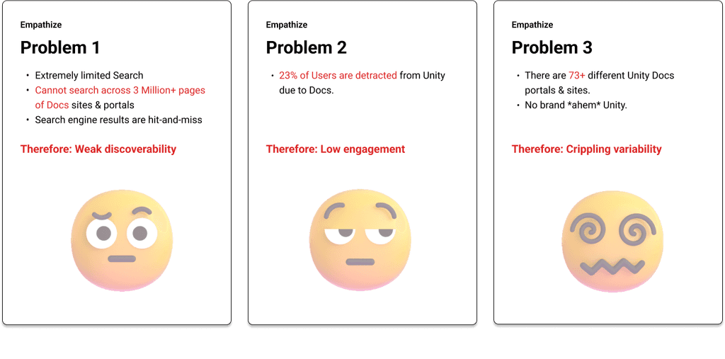
Identifying Key Problems: Through surveys and interviews, we discovered critical issues and trends. This deep understanding allowed us to develop targeted strategies to tackle the challenges head-on.
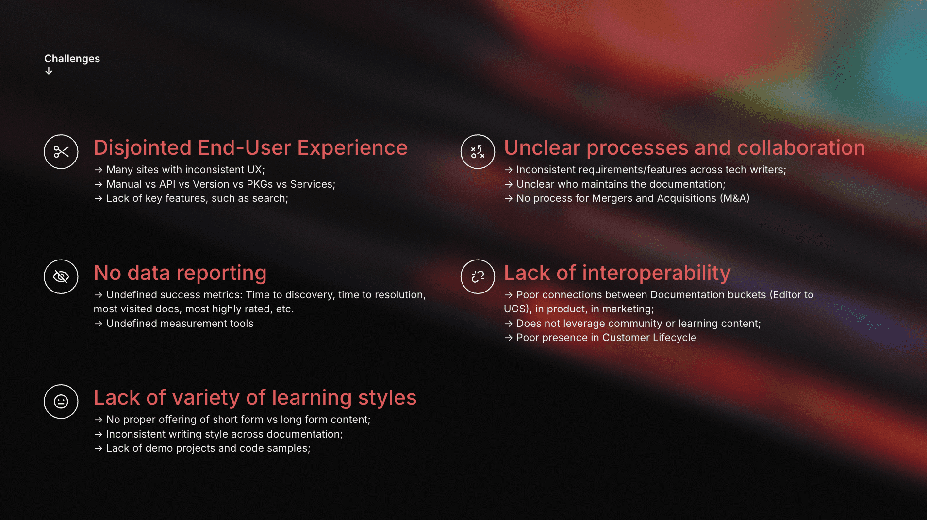
Activities and outputs
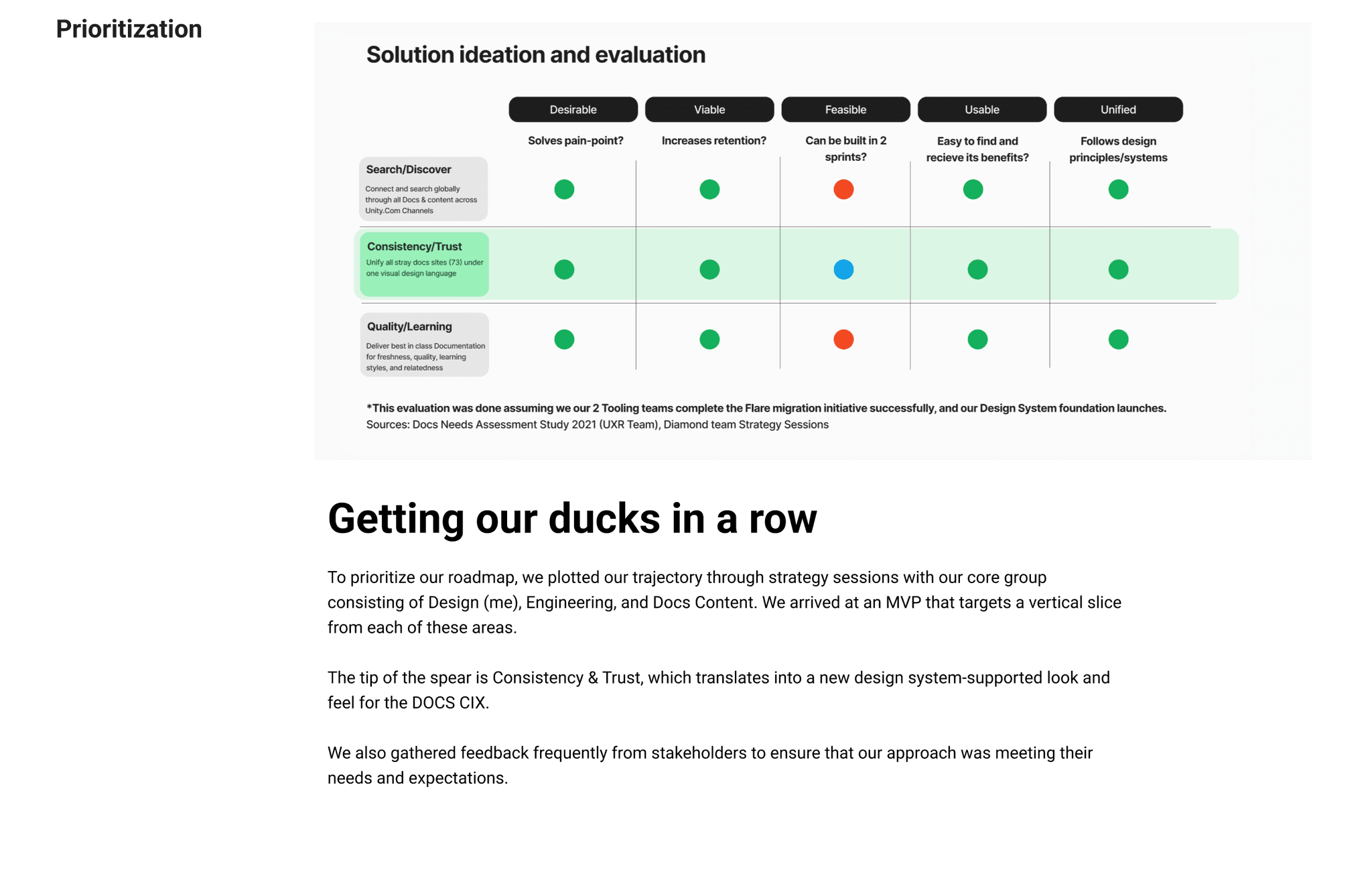
Key Insight: Conducting a workshop with Documentation Leads to encourage collaboration, shared understanding, and map out the journey of contributors.
"It's great that you're doing this because it'll help the group come together and start capital momentum."
— Mary Luther, Senior Product Design Lead
— Brian Coughlin, Senior Product Manager
The workshop not only fostered shared understanding but also highlighted the need for a smaller, more focused group of SMEs. This realization led to the formation of such a group, further aiding our efforts to understand and address pipeline demands and blockers.
Forging our Principles
"It's great that you're doing this because it'll help the group come together and start capital momentum."
— Mary Luther, Senior Product Design Lead
Our design principles for the Content Information Experience focus on delivering an intuitive and user-centric interface. Predictive design ensures we anticipate and address user needs proactively, presenting information in a way that is both relevant and timely. Adaptive principles allow us to cater to various learning styles by offering multiple methods for users to engage with content, ensuring accessibility and understanding. Finally, Integrated design aligns with users' contexts, seamlessly providing documentation and support at crucial moments, whether they're in the creative process or making purchasing decisions. Together, these principles drive a cohesive, responsive, and user-focused experience.
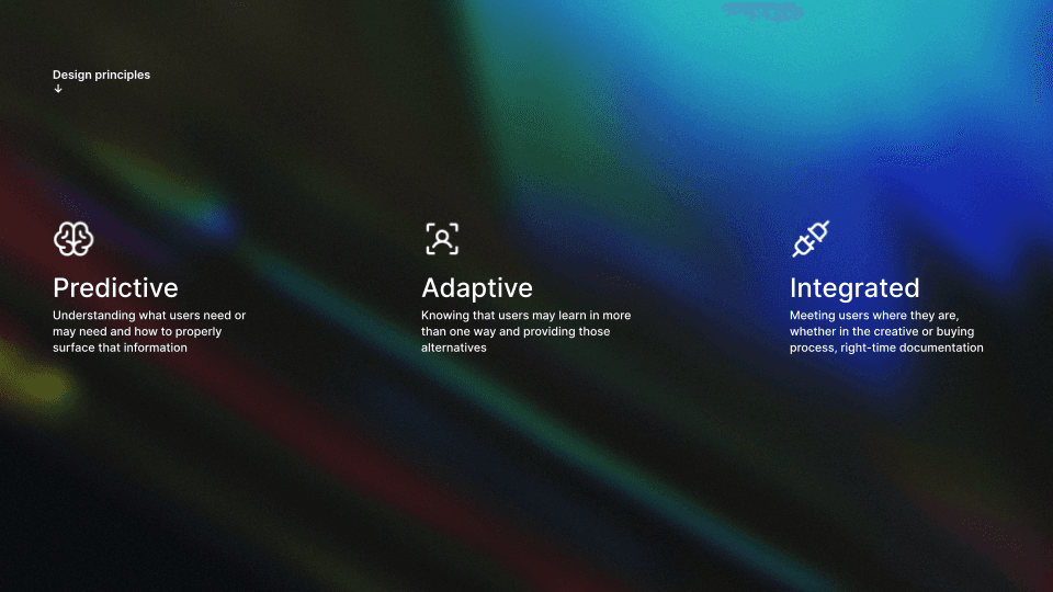
Key Insight: Establishing design principles to navigate the project and ensure a consistent, effective, and user-centric design approach.
Conclusion
I was thrilled to build and refine this new information experience for our customers. Collaborating with Brian, Anton, and the entire CIX team, I'm confident the Guardian Design system will bring our customers' value for years to come.
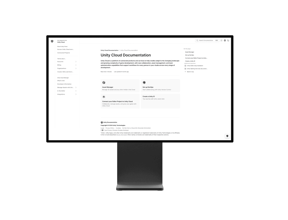
We were in continuous development with a working live environment. The latest screens showcased a unified, streamlined design that ensured consistency across all documentation sites.
Focusing on the creator authoring pipeline was crucial to eliminating blockers and redundancies in documentation. Close collaboration with creator and developer teams helped identify pain points and streamline workflows.
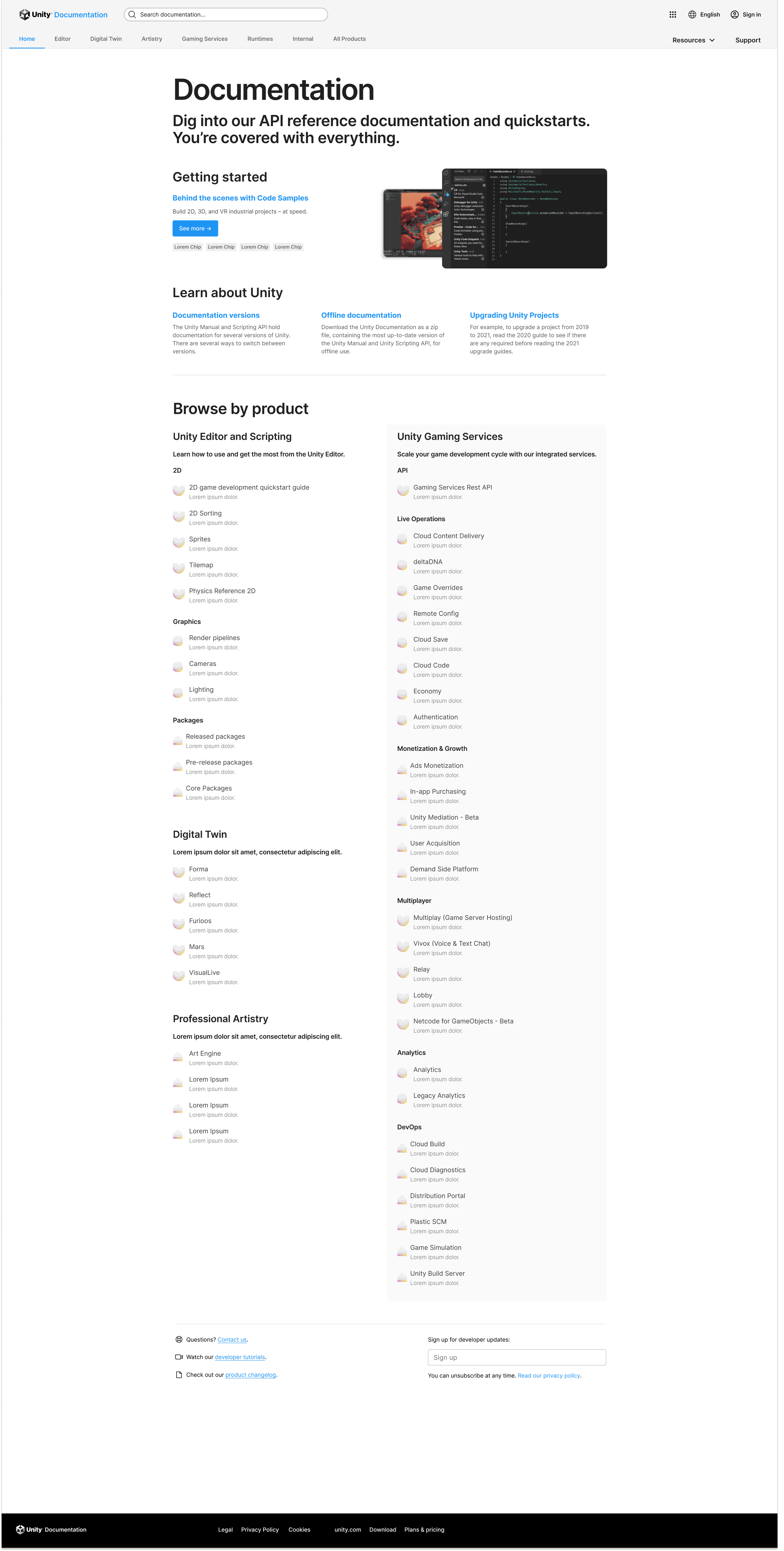
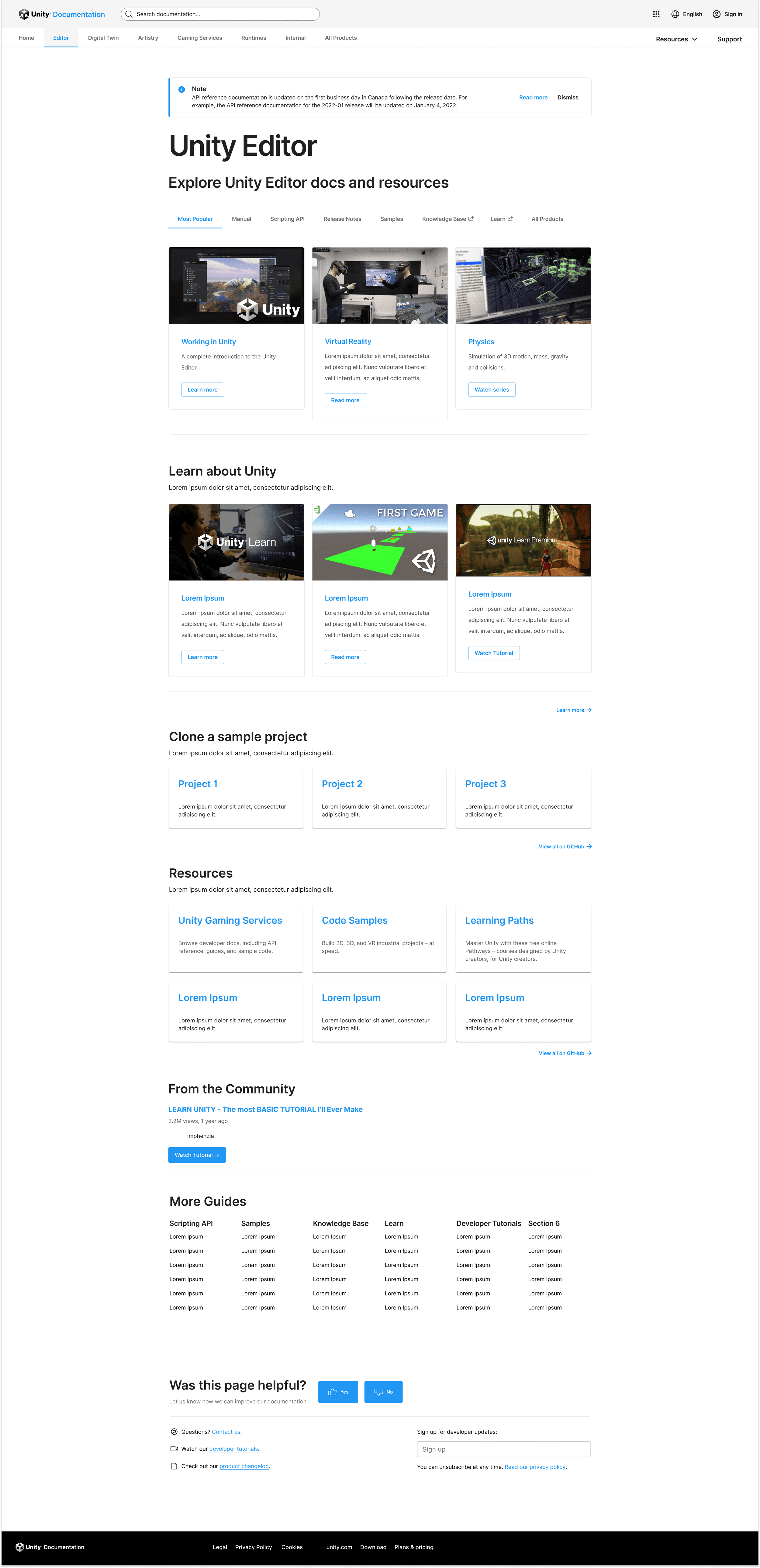
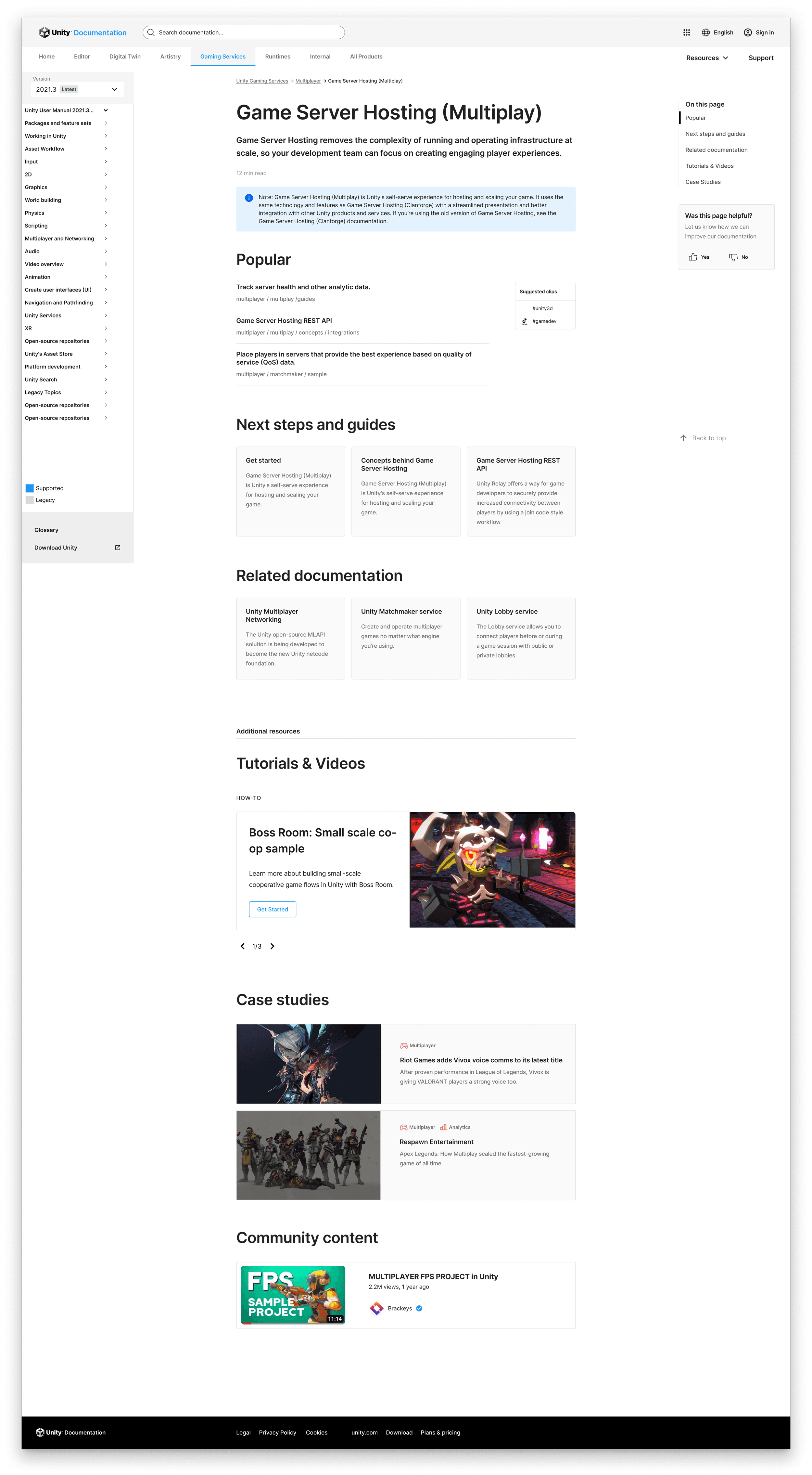
Final Screens before Handoff to Anton's Engineers
Here's where it's at now…
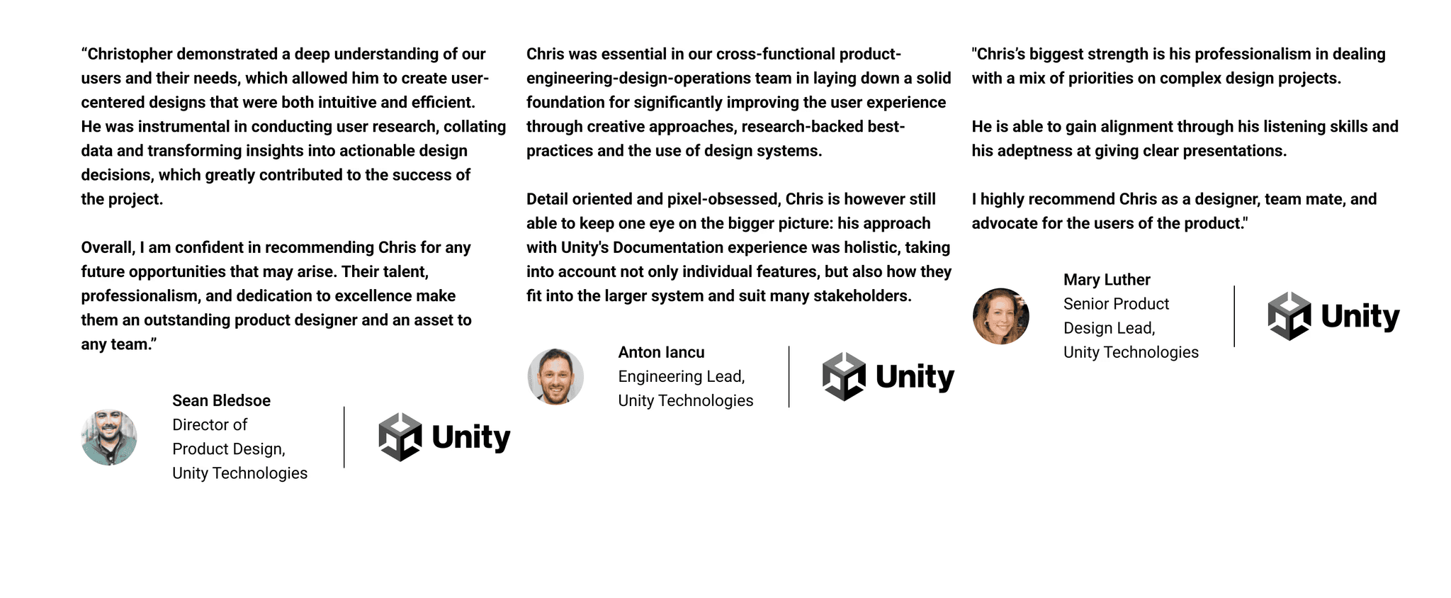
Here's what they Say
Next up


